


We've redesigned our asset class pages to be faster, higher definition, and more powerful than ever. This update covers our Futures, Forex, and Crypto pages.
With a single look, traders can visualize the best performing tickers within any of the world's largest asset classes outside of the stock market, check their performance across timeframes, and see each asset class in different visualizations including Prices, Performance, Charts, and Maps.
Our Futures page, for example, is redesigned with easier navigation tools and far more data – check it out:
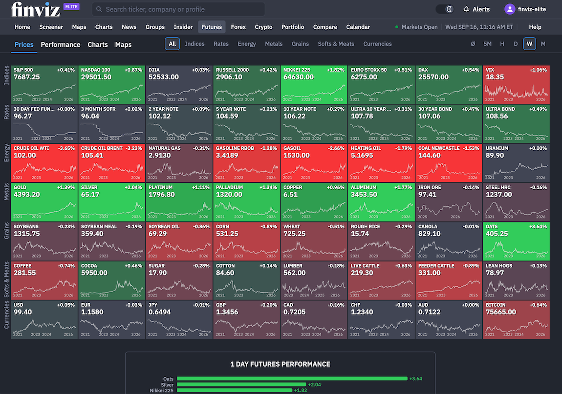
New Ways to Track Asset Class Performance
Our Performance page has been upgraded with more detail and endless ways to measure performance.
Check out this YTD performance for Futures with our performance chart on the left and data tables on the right:
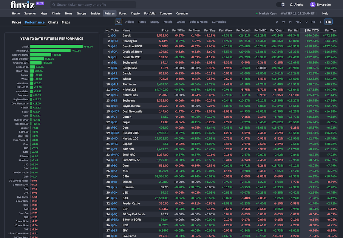
Here are a few tips for setting up the Performance page to your liking:
- Zoom in and out of the window to make the visualizations larger and smaller. The tools will automatically rearrange itself until you get your preferred view.
- Be sure to select the timeframe that you're looking for and hone in on the visual that fits your still. The data tables are perfect for seeing multiple timeframes at once while the bars are a focused look at performance.
- Be sure to click any symbol you see to go directly to that specific symbol page for even more detail.
High Definition Asset Page Maps
The Crypto Maps page or Forex Maps page turns each asset class performance into an interactive Heatmap, making it easy to spot the market’s biggest gainers and losers.
Traders can compare performance across daily, weekly, monthly, quarterly, YTD, and yearly timeframes. Intraday views from one minute to one hour are also available.
Hover your mouse over the map to get a detailed list of the entire crypto universe available on Finviz:
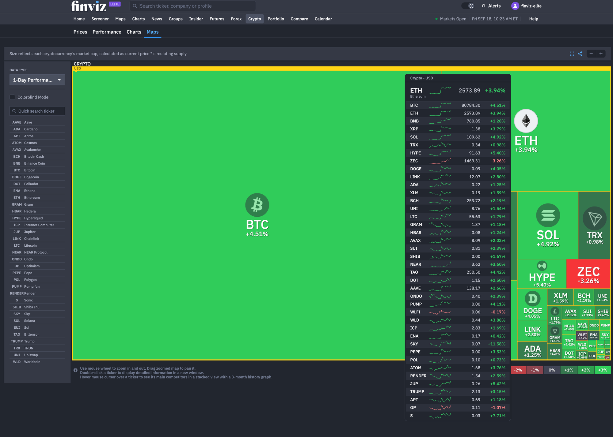
Each asset is sized by market capitalization, so larger cryptocurrencies take up more space on the map.
The map includes zooming, panning, ticker search, and double-click navigation to detailed asset pages.
Hovering over an asset shows its competitors along with a three-month performance chart.
Other features include Full Screen, Share Map, and Colorblind Mode, giving users more flexibility when exploring and sharing market data.
Performance Charts for Crypto, Futures, and Forex – Compare Returns Across Multiple Timeframes
The new Performance pages offer a straightforward way to compare an entire asset class, for example cryptocurrencies, across different timeframes on a single visual:
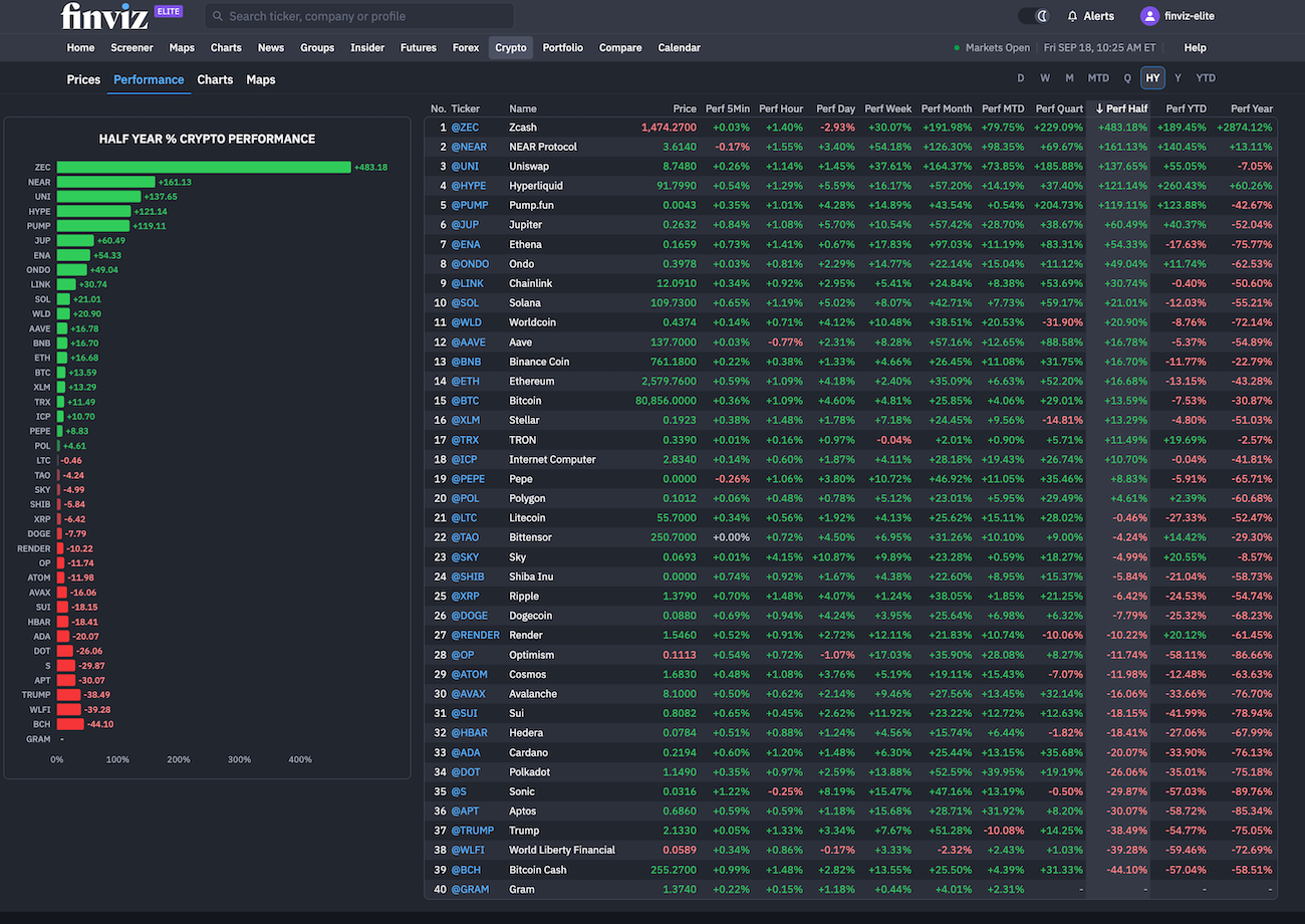
The table shows each asset’s ticker, name, current price, and performance over 5 minutes, 1 hour, 1 day, 1 week, 1 month, quarter, half-year, YTD, and 1 year.
Users can switch between timeframes, sort the table by performance, and quickly spot the strongest and weakest moves. The page also supports multiple quote currencies, including USD, USDT, EUR, and BTC, giving traders more flexibility when comparing crypto assets.
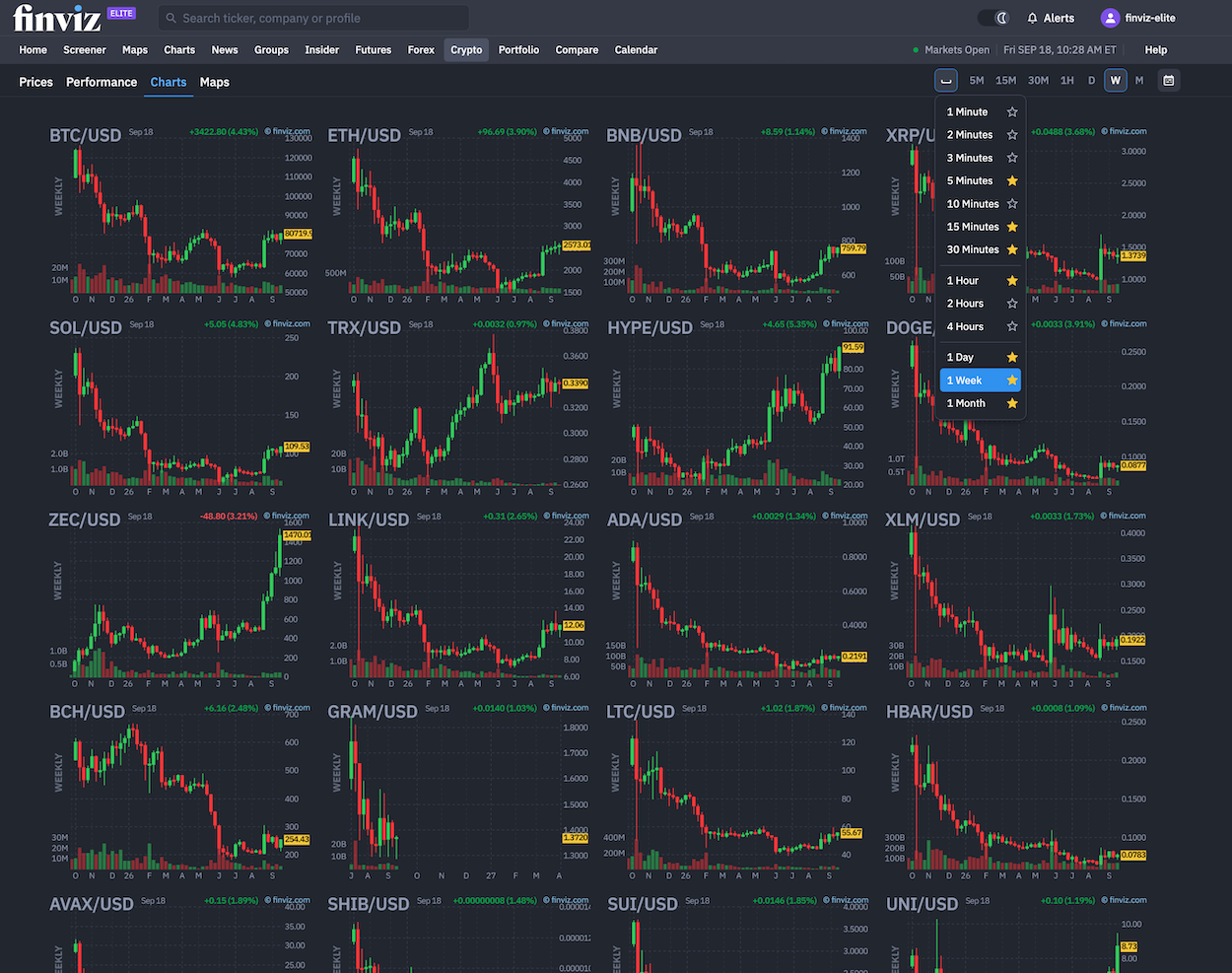
A Redesigned Charting Experience Across All Asset Pages
We've also expanded the charting experience. Users now get larger charts, clearer timeframe controls, custom date ranges, and one-click capabilities to dive deeper into any chart that catches your eye:
One Workflow for Different Markets
The broader goal of the redesign is consistency. Whether users are researching Bitcoin, EUR/USD, Gold futures, or another asset, they now get a familiar interface that brings pricing, performance, charting, and visual analysis together.
For crypto traders, Crypto Maps and Crypto Performance offer two different ways to assess the market.
Maps provide a quick visual view of market strength and weakness, while Performance provides detailed figures for comparing assets across multiple timeframes.
Together with the redesigned Futures, Forex, and Crypto pages, these updates give Finviz users a more unified way to scan markets, compare assets, and move from a broad market view to detailed analysis.