


Our new Matrix Map is a first-of-its-kind capability that no other platform or service has yet created.
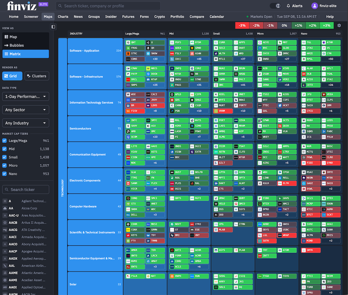
In short, we’ve built a highly detailed, color-coded, completely dynamic market visualization that shows which stocks are rising, falling, and trending organized by industry and market capitalization that gets richer and richer the more you scroll down. To us, this is the next evolution into something we championed since 2007: Heatmaps.
Check it out:
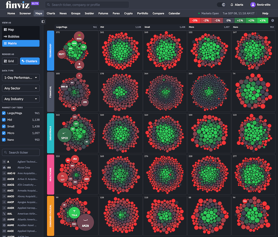
Our Matrix tool can also be visualized in other ways, including the Cluster capability:
How Matrix Works
Matrix organizes thousands of U.S. stocks into a visual grid so you can instantly see where strength is building, where weakness is spreading, and how companies of different sizes are performing within the same part of the market.
For example, you can quickly determine whether strength in technology is concentrated in the largest software companies or spreading into small- and micro-cap names. You can see whether an industry is moving together, whether one company is breaking away from its peers, or whether a trend is appearing across several market-cap tiers at once.
In a matter of seconds, a massive amount of market data becomes something you can scan and understand visually.
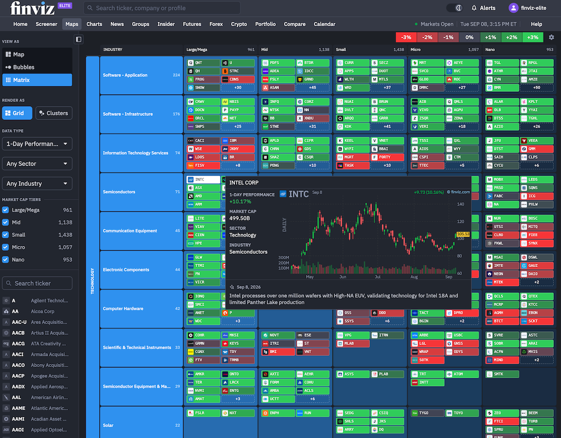
In addition, you can hover your mouse over any stock to learn more about that stock, what it does, if there's news, and why it's moving – check this out as we hover our mouse over Intel on the Matrix:
Grid View and Clusters: Two Ways To Try Matrix
The default Grid view is designed for precision. Every row represents an industry, and every column represents a market-cap tier. Inside each section, individual tickers are displayed as compact, color-coded tiles.
This makes it easy to move from a broad market observation to the exact stocks driving it. If an industry suddenly turns bright green, you can immediately see whether the move is broad or being led by only a few names. If large caps are weak while small caps remain strong, that difference is visible without opening multiple screens or comparing separate watchlists.
Switch your Matrix view to Clusters for a different perspective.
Clusters transforms the Matrix into groups of circles organized by sector and market-cap tier. Each circle represents a company, its size reflects the company’s relative market capitalization, and its color reflects the selected data point. In this example, we've created clusters of Large caps on the left and Mid caps on the right:
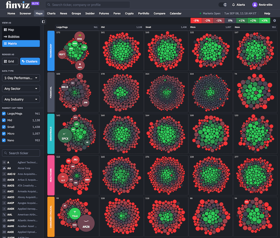
This can reveal an important distinction that traditional index performance often misses: whether the market is truly moving together or whether a few giant companies are creating the appearance of strength.
Go Far Beyond Daily Performance
Matrix opens with 1-Day Performance, but that is only the beginning.
You can rebuild the entire visualization using a wide range of technical and fundamental data points, including:
- Intraday performance from one minute through four hours
- Aftermarket performance
- Weekly, monthly, year-to-date, and multi-year performance
- Drawdown from the 52-week high
- Gain from the 52-week low
- Relative volume
- Valuation metrics such as P/E, forward P/E, PEG, price-to-sales, and EV/EBITDA
- Growth metrics for earnings, sales, and dividends
- Profitability metrics including ROA, ROE, ROIC, and margins
- Debt and liquidity ratios
- Insider transactions and short float
- Analyst recommendations
- Earnings-day performance and upcoming earnings dates
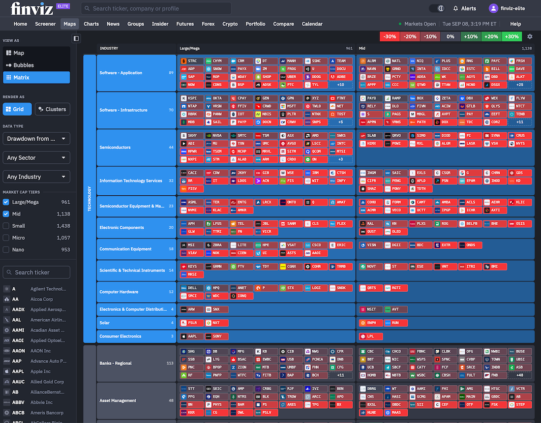
Select a new metric and every color in the Matrix adjusts with it. Here's the Matrix organized by Drawdown From 52-Week High allowing you to understand where the deepest drawdowns are occurring:
Design The Matrix To Your Needs
Matrix also includes several display options designed to make dense market data easier to read.
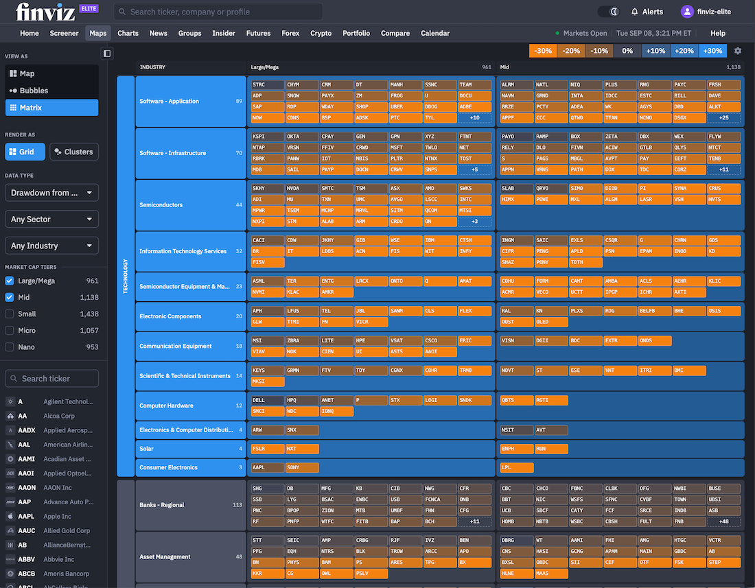
You can display company logos alongside ticker symbols, enable Why Is It Moving for additional context, or switch on Colorblind Mode for a more accessible color palette. You can also move between Grid and Clusters at any time, depending on whether you want exact organization or a broader visual impression.
Here's the Matrix in Colorblind Mode without any logos:
A New Lens on the Entire Market
Most market tools force you to choose between a high-level overview and a detailed stock list. Matrix brings both into one view.
You can see the market’s overall breadth, compare strength across sectors and industries, identify rotation between market-cap tiers, and locate the individual stocks behind each move all from a single visualization.
We're excited to hear how you utilize our new Matrix tool.
The Finviz Team