


We've launched a new feature that gives all of our members the ability to embed our widely used Maps product on their site or app.
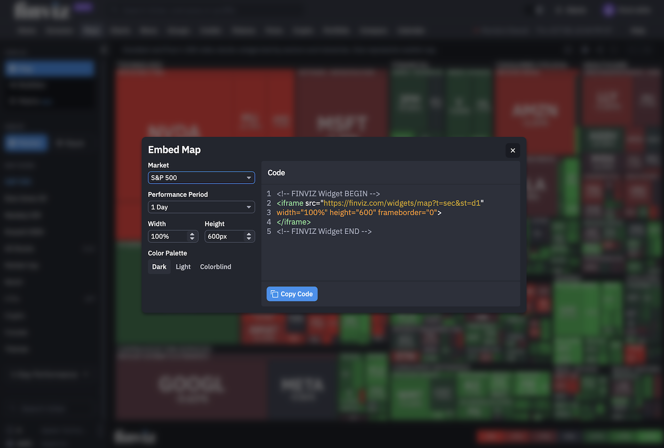
Choose a market and performance period, set the map’s dimensions and color palette, then copy the generated code and paste it where you need it.
The Power of Our Maps – Now on Your Site
Our Maps make it easy to visualize the world’s most important assets and customize how you view each asset. The Embed Map feature brings that same flexibility to your website, with our most popular customization options to help you create a map of your own:
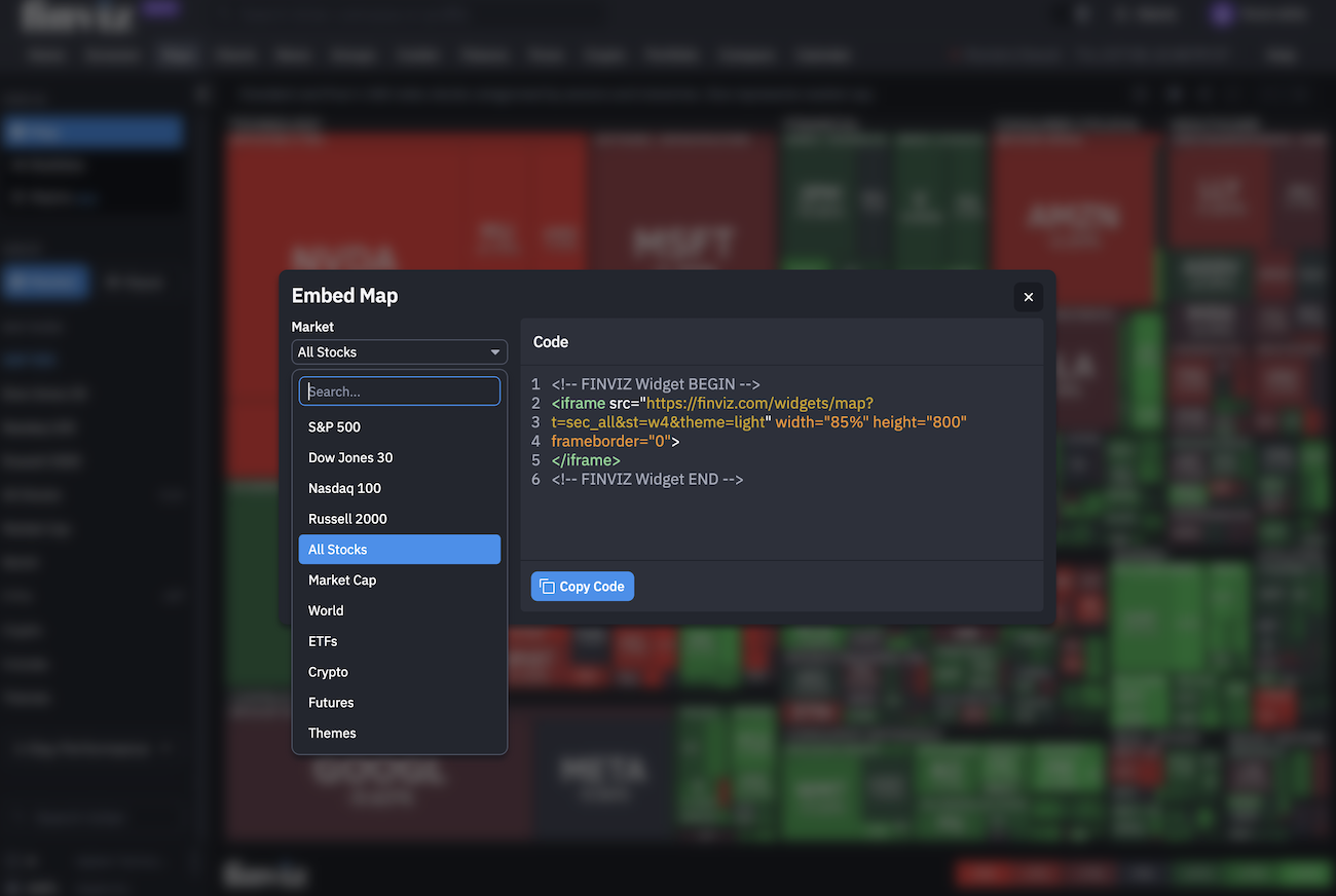
Pick Your Market: Choose from S&P 500, Dow Jones 30, Nasdaq 100, Russell 2000, All Stocks, Market Cap, World, ETFs, Crypto, Futures, and Themes.
Select Your Performance Period: Choose 1 Day, 1 Week, 1 Month, 3 Months, YTD, or 1 Year.
Set Your Width and Height: Specify the width as a percentage or in pixels, and the height in pixels. The example below uses 100% width and 600px height.
Choose Your Color Palette: Select Dark, Light, or Colorblind.
Copy Your Embed Code: The iframe code updates to reflect your settings. Click Copy Code, then paste it into your website.
How to Get Started Embedding Finviz Maps
Go to the Finviz Map page and find the new Embed Map button located on the menu off to the top-right hand side of the map:

The embed Maps tool will appear front and center. Here is where you can customize the code and features to fit your exact needs.
Select your market, performance period, dimensions, and a color palette and it will automatically update in the Code dialog box.
In the screenshot below, we're creating an embed for All Stocks in the market rather than a select asset or index. Keep in mind you can create a specialized embed across all assets as seen here in the dropdown menu:
Now that you've selected your Map, it's time to focus on the specific period of time that you want the Map to calculate and display.
The menu shown includes 1 Day, 1 Week, 1 Month, 3 Months, YTD, and 1 Year. A short-term map and a year-to-date map tell different stories, so select the period in the text around the embed that best fits where you're embedding the Map:

Our new Maps embed feature comes with customizations to adjust the width, height, and color so that it fits exactly where you need it.
A width of 100% lets the map fill the available container where it's placed. The height is set in pixels, with 600px by default, but you can change this to your requirements.
Next choose the theme you wish to embed whether it's Dark, Light, or Colorblind. The Colorblind option can help broaden accessibility while the Dark or Light modes can blend into your site:

Lastly, copy the code and add it to your page - you're done. We've made our Embed Maps feature easy, fast, and fully customizable.
Bring the Market to Your Readers
With embedded Finviz Maps, you can bring market visuals, sector performance, and individual assets directly into your articles, research, dashboards, and more all without writing a line of code. Just copy and paste.
Since we launched our market maps in 2007, they’ve become a staple of the financial web. Now, you can make them part of your own website, customized for your content and your audience.
Thanks for reading!
The Finviz Team