|
|
|

|
|||||
|
|
|
Wall Street hasn't been hurting for catalysts of late. Following a nearly two-and-a-half-year climb in the Dow Jones Industrial Average (DJINDICES: ^DJI), S&P 500 (SNPINDEX: ^GSPC), and Nasdaq Composite (NASDAQINDEX: ^IXIC), which was spurred by the rise of artificial intelligence (AI), investors have been hypnotized in 2025 by President Donald Trump's ever-changing tariff policies, wild swings in Treasury bond yields, and the return of stock-split euphoria.
But it's fair to question whether Wall Street and the investing community are missing the bigger picture: The U.S. economy.
Although the economy and stock market aren't tied at the hip, corporate earnings often ebb and flow with the domestic economy. According to one recession forecasting tool, which hasn't been wrong in 59 years -- and has only been incorrect once when back-tested to 1959 -- things may not be as rosy for the U.S. economy and stock market as they appear on the surface.
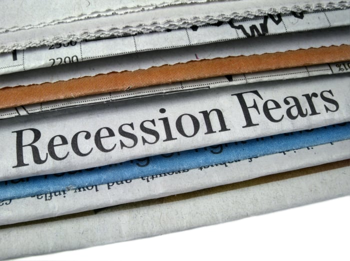
Image source: Getty Images.
There isn't any data point or forecasting tool on the planet that can guarantee what's going to happen next with the U.S. economy and/or Wall Street. But there are select metrics, forecasting tools, and events that have strongly correlated with directional moves in the Dow, S&P 500, and Nasdaq Composite throughout history. For instance, notable declines in M2 money supply have historically led to economic downturns and tough times for Wall Street.
Perhaps Wall Street's biggest concern at the moment has less to do with Trump's tariff policies, and everything to do with what the Federal Reserve Bank of New York's recession probability tool says comes next.
The New York Fed's recession predicting tool analyzes the spread (difference in yield) between the 10-year Treasury bond and three-month Treasury bill to calculate how likely it is that a recession will take shape over the next 12 months.
In a healthy economy, the Treasury yield curve slopes up and to the right. This is to say that longer-dated bonds maturing in 10 to 30 years sport higher yields than Treasury bills maturing in a year or less. The longer your money is tied up in an interest-bearing asset, the higher the yield should be.
When the yield curve inverts is where trouble starts brewing. This is where short-term Treasury bills have higher yields than long-term Treasury bonds. It's typically an indication that investors are worried about the outlook for the U.S. economy.

The only false positive for the New York Fed's recession probability tool occurred in 1966. U.S. Recession Probability data by YCharts. Gray areas denote U.S. recessions.
The New York Fed's recession probability forecast is updated on a monthly basis, with the May 2025 update pointing to a 30.45% chance of a U.S. recession taking shape by April 2026. While this is well off the 2023 high of a greater than 70% chance of a recession occurring -- this was the highest reading in four decades -- every probability reading above 32% since 1966 has eventually been followed by a U.S. recession.
But there's more to this correlation than simply looking at recession probability percentages. More often than not, previous recessions didn't materialize until the yield curve un-inverted and began moving sharply higher. You can see this dynamic in the 10-year and three-month Treasury spread comparison below.

10 Year-3 Month Treasury Yield Spread data by YCharts. Gray areas denote U.S. recessions.
Since we're coming off the steepest inversion of the 10-year/three-month yield curve in four decades, it's only natural that it's taken a bit longer for the yield curve to attempt to right itself. This un-inversion of the yield curve, coupled with the history behind the New York Fed's recession probability tool, strongly points to a U.S. recession taking shape.
It's worth noting that the initial read of U.S. first-quarter gross domestic product (GDP) showed a 0.3% contraction in the economy. While this is notably better than what the Federal Reserve Bank of Atlanta's GDPNow model had been forecasting, in terms of the U.S. economy shrinking, it still aligns with the New York Fed's recession indicator potentially being right.
Based on an analysis from Bank of America Global Research, around two-thirds of the S&P 500's peak-to-trough drawdowns between 1927 and March 2023 occurred during, not before, U.S. recessions.

Image source: Getty Images.
Seeing a highly successful predictive indicator forecast a recession may not be what you, as an investor and/or working American, want to hear. But the pendulum for economic and stock market cycles swings in both directions -- and quite disproportionately.
Regardless of fiscal and monetary policy, recessions are normal, healthy, and inevitable aspects of the economic cycle. While higher unemployment and weaker wage growth often accompany recessions, economic downturns are perhaps best known for being short-lived.
In the nearly 80 years since World War II ended, the U.S. economy has navigated its way through a dozen official recessions. The average length of these 12 economic downturns is just 10 months, with none surpassing 18 months in length.
On the other hand, the typical period of growth for the U.S. economy is roughly five years over the same timeline. The economic boom-and-bust cycle is anything but a mirror image, and it explains why the U.S. economy has grown noticeably over the long run.
This wide disparity between optimism and pessimism can also be observed on Wall Street.
It's official. A new bull market is confirmed.
-- Bespoke (@bespokeinvest) June 8, 2023
The S&P 500 is now up 20% from its 10/12/22 closing low. The prior bear market saw the index fall 25.4% over 282 days.
Read more at https://t.co/H4p1RcpfIn. pic.twitter.com/tnRz1wdonp
In 2023, the analysts at Bespoke Investment Group published a data set to social media platform X that compared the length of every S&P 500 bull and bear market dating back to the start of the Great Depression in September 1929.
Bespoke found that the average bear market downturn in the benchmark S&P 500 lasted 286 calendar days, or approximately 9.5 months. The data set also shows that the lengthiest bear market on record was 630 calendar days during the oil embargo of the mid-1970s.
On the other hand, the average bull market has stuck around for 1,011 calendar days spanning nearly 94 years. What's more, if the current bull market for the S&P 500 were extrapolated to the present day, more than half of all bull markets since September 1929 (14 out of 27) would have lasted longer than the lengthiest bear market.
It simply doesn't make much sense for investors to become too preoccupied with short-lived downturns when historical data conclusively shows that the U.S. economy and stock market spend a disproportionate amount of their time in the proverbial sun.
Before you buy stock in S&P 500 Index, consider this:
The Motley Fool Stock Advisor analyst team just identified what they believe are the 10 best stocks for investors to buy now… and S&P 500 Index wasn’t one of them. The 10 stocks that made the cut could produce monster returns in the coming years.
Consider when Netflix made this list on December 17, 2004... if you invested $1,000 at the time of our recommendation, you’d have $635,275!* Or when Nvidia made this list on April 15, 2005... if you invested $1,000 at the time of our recommendation, you’d have $826,385!*
Now, it’s worth noting Stock Advisor’s total average return is 967% — a market-crushing outperformance compared to 171% for the S&P 500. Don’t miss out on the latest top 10 list, available when you join Stock Advisor.
*Stock Advisor returns as of May 12, 2025
Bank of America is an advertising partner of Motley Fool Money. Sean Williams has positions in Bank of America. The Motley Fool has positions in and recommends Bank of America. The Motley Fool has a disclosure policy.
| 4 hours | |
| 4 hours |
Berkshire Hathaway Takes Stake In New York Times, Cuts Apple, Amazon Holdings
BAC
Investor's Business Daily
|
| 5 hours | |
| 6 hours | |
| 6 hours | |
| 6 hours | |
| 7 hours | |
| 11 hours | |
| 13 hours | |
| 15 hours | |
| 15 hours | |
| 16 hours | |
| 16 hours | |
| 20 hours | |
| Feb-16 |
Join thousands of traders who make more informed decisions with our premium features. Real-time quotes, advanced visualizations, backtesting, and much more.
Learn more about FINVIZ*Elite